A visualization of 150 years of Philippine warming is now in my business card.
Try my code in Google Colab here
A year since my last post here, hello again!
I’ve been wanting to design a personal business card for ages. While scouting for ideas, I realized this blog was due for a serious update too.
I figured I’d hit two birds with one stone by creating a fresh visualization and turn that into the business card’s centerpiece– a viz card if I may claim the term! XD
The viz card#
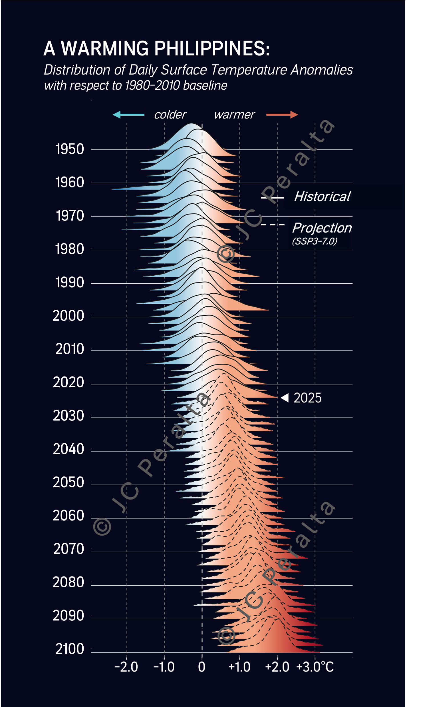
My viz card - The distribution of Philippine Daily Surface Temperature Anomalies with respect to 1980-2010 baseline
Key Results and Caveats#
The visualization reveals the following results:
-
Average annual temperature of Philippine land has already warmed by 0.7°C (24.4°C to 25.1°C) from 1950-2025, or about +0.03°C/yr .
-
According to the climate projection used (EC-EARTH3-Veg-LR SSP 3-7.0 scenario), the Philippine region will continue to warm up to an average of 25.6°C (+1.0°C) in 2050 and up to 26.6°C (+2.0°C) in 2100, which is consistent with what we see in current studies
-
If emissions follow this projection, temperatures colder than the baseline period from 1990 and older will likely be rarely experienced anymore in the country starting at around 2070.
However, there are caveats to these findings:
- The historical data used (ERA5-Land) may deviate from local ground station measurements (In another project, I personally have noted that the temperatures are colder in the reanalysis by about 1-1.5°C). A formal validation study has yet to be done for the Philippines.
- The viz only shows a single future climate model projection for simplicity. In studies, a robust climate trend requires an ensemble of multiple models to provide a higher degree of confidence.
The inspiration#
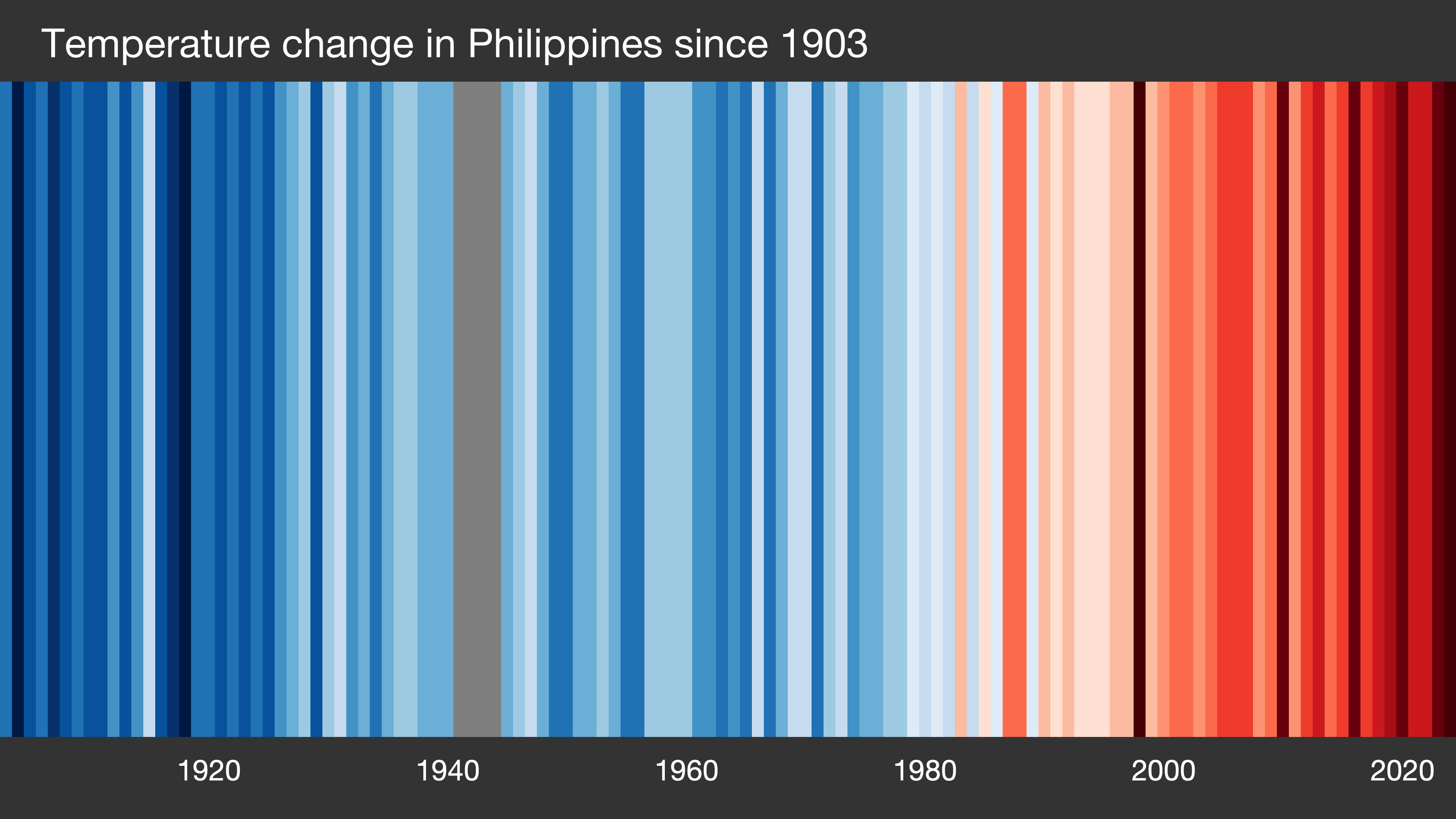
Increasing temperatures in the Philippines represented by climate stripes of developed by Ed Hawkins of the University of Reading
I wanted to create a climate viz that focuses on Philippines and reflects my skill as a professional in the field. Right now, the most popular ones are the climate stripes developed by the great visualizer Ed Hawkins of University of Reading, UK.
It is very straightforward–blue is cooler, red is warmer, and unmistakably, the recent years are hotter than the previous ones. This drives the point but it doesn’t pique my interest. I hunger for more details.
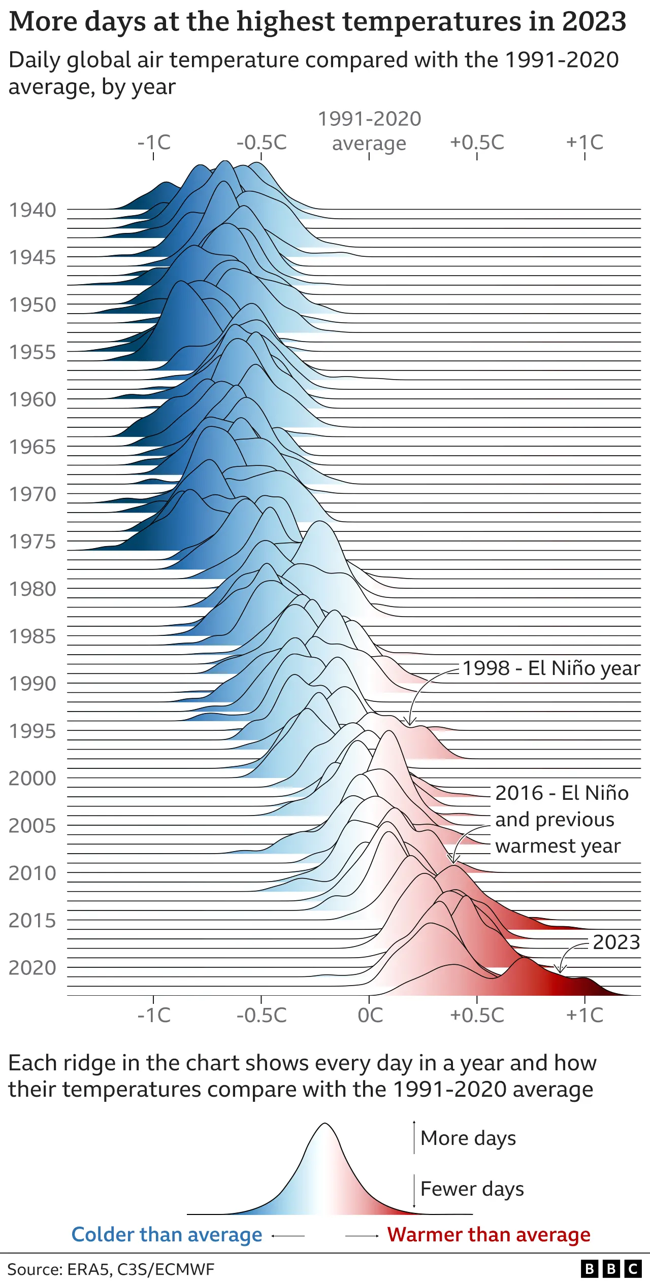
Distribution of global temperature anomalies (°C) relative to 1991–2020 for each year from 1940 to 2025 by Ervan Rivoult for BBC
Then I saw this beautiful plot from BBC’s 2023 confirmed as world’s hottest year on record article by one of the data visualization artists I follow, Erwan Rivault (view his portfolio here). This is a ridgeplot of temperature anomalies filled with a horizontal gradient.
I decided to go with this viz but with data focused on Philippines. As soon as I started looking up python modules that can do this viz, I realize that its not straightforward and might need “hacks” to replicate, which I find too cumbersome. There is, however, a module in R gridges that can do this viz in a very straightforward manner.
But the thing is, I dont know R! So what I did was I coded in python, and used Gemini to translate it to R. I provided the final code as a Google Colab notebook and added design tweaks to the plot so it would fit nicely to my card.
(The full climate data processing code is also available, message me if you are interested to build on this!)
Anomalies are computed from a standard 1980-2010 baseline#
Anomaly in climate data is defined as the deviation from a “normal” climate pattern. This quantity shows how much warmer or cooler a specific period is compared to the long-term average. This average typically covers 30 years as recommended by the World Meteorological Organization (WMO).
To compute this, you first average the temperature for each specific day across the 30-year window to create a “climatology” curve that represents the expected seasonal cycle. This daily baseline is then subtracted from both historical measurements and future model scenarios.
Datasets Used#
I used two data sources for the visualization: one to cover the historical period (1950-2025) and another for the future period (2026-2010)
Historical data is from a reanalysis dataset#
Reanalysis datasets are blends of climate model output and observations (stations, radar and satellite imagery). While ground measurements are ideal, these are often patchy or incomplete. The climate model takes these in and acts as a bridge to create a continuous, consistent map of the global atmosphere for every hour of every day over several decades.
Here, I used ERA5-Land daily surface temperature for the historical period. ERA5-Land is a reanalysis dataset provided by the European Centre for Medium-Range Weather Forecasts. The data is a replay of the land component of the more famous ERA5 climate reanalysis but with a finer 9km resolution, about 3x higher resolution to that of the latter (~30km).
Future projection data is a CMIP6 SSP scenario#
The Coupled Model Intercomparison Project Phase 6 (CMIP6) is a global collaborative effort where climate modeling centers around the world run the same set of experiments to better understand past, present, and future climate changes.
To explore potential futures, CMIP6 uses Shared Socio-economic Pathways (SSPs), which are scenarios that describe different ways the world might evolve in terms of population, economic growth, and environmental policy. These SSPs are essentially “storylines” ranging from sustainable, “green” development (SSP1) and “middle of the road” trends (SSP2) to high-inequality (SSP4) or intensive fossil-fuel-led growth (SSP5).
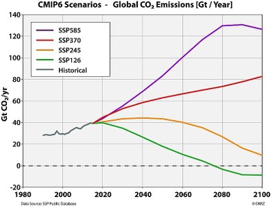
Historical and future global CO2 emissions contained in Shared Socioeconomic Pathways (SSP) scenarios
A selection of CMIP6 projection datasets can easily be downloaded from the Copernicus Climate Data Store. However, picking the most appropriate future data for an area of interest requires some reading from existing studies.
-
Among chosen 28 models, the EC-EARTH3-Veg-LR model performed relatively well for the Philippine subregion according to metrics analyzed by Desmet and Ngo‐Duc, T. (2021).
-
For the SSP scenario, I picked SSP 3.70 (also called Regional Rivalry). As a high-emissions scenario, SSP3-7.0 sits between the low emission SSP2-4.5 and high emission SSP5-8.5 scenarios. It also tracks the current trend of emissions seen in the past 5 years.
Overshooting data needs bias correction#
The bias, or the difference from observed measurements, is the metric we use to quantify the accuracy of a climate model variable. Even the most advanced models will have some degree of bias because these use relatively coarse grids and must use mathematical approximations for complex local weather.
Bias correction is a statistical method to adjust the distribution of values so the model more closely aligns with historical data while still keeping its inherent features (Read more here).
I looked at the future projection data, and although EC-EARTH3-Veg-LR was good, the projections shoot up to +4 to +6 C at 2050-2060, which is not realistic. I have to use a bias correction method to bring it closer to the observed distribution.
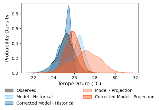
Comparing the historical ERA5-Land data and raw and bias corrected EC-EARTH3-Veg-LR model data
Above is a quick before and after view of the model data distribution during bias correction. I used the modified quantile mapping function from Byun and Hamlet (2024), which is useful when the distribution of future simulations largely differs from historical simulations. The method ensures that the bias-corrected values are not exaggerated and retain the rank structure of the model data while preserving climate change signals in the bias-corrected outputs.
First, the noticeably historical model data (light blue) with a warm average bias (~2°C) and right-skewed distribution is bias corrected (dark blue) to be nudged closer to the observed distribution (black). The parameters are saved and then applied to the raw projetion distribution (orange), creating the final projection distribution (dark orange).
While this may seem like a very crude way of post-processing the data and may itself introduce inconsistencies, I think this is better than just using the raw data which have limited local input for Philippine-specific climate.
Next Steps#
I’m proud of this viz because I got to practice my climate big data wrangling skills again, and replicated a figure that I had admired so much when I first saw it. I don’t really have a concrete plan on where I can use the insights of this viz, but happy to just put this out here and collaborate on any leads this will bring me.
While most business cards are eventually tucked away in a drawer, I designed this one to serve as a tangible reminder that the data we analyze today directly shapes the environment we will inhabit tomorrow.
I hope this was useful! Thank you so much and see you in the next blog!