Inflation and inequality in the music streaming market.
Fork this project in Github here
Get the data in Kaggle here
This is Part 2 of a 2-part data analysis post about the PH music streaming market. You may check out Part 1 here
In the first part of this analysis, I floated the idea of the number of streams as a currency that can purchase a position in the music streaming market charts. Like a real currency, the ability of a stream to take a track to a position also changes with time–the market experiences inflation. Compared to previous years, you will need more streams to make it in the charts now, more so to land the coveted Top 10 positions.
And its not only the streams per se–the current artists in the charts will also determine the likelihood of reaching a target position. A Top 1 position achieved during days when very famous artists are competing is a much harder feat to achieve.
For this post, I wanted to quantitatively describe how these 2 factors - inflation and inequality - track the development of our local music streaming market. I used 2 economic concepts to quantify these- the Consumer Price Index (CPI) for inflation and the Gini index for inequality.
Below are two interactive line charts that show how the CPI and Gini Index based on the streams of the Daily Top 200 charts evolved during the past 5 years. I invite you to hover on the lines to view the calculated value of these indices for a particular quarter.
The trend could be seen at first glance:
-
Over the past 5 years, the music charts CPI has increased and now indicates that tracks need to be streamed about ~50% more to achieve the same position they had back in 2017.
-
The Gini index, however, is decreasing, hinting that the lower chart positions have been more competitive and catching up to the performance of those in the higher chart positions.
How then does these two seemingly contrasting results affect an aspiring artist chances of success in the market? I'll be discussing these two quantities in more detail in the sections below.
An exclusive market- Spotify PH Daily Top 200 charts#
Doing a quick unique elements check on the available PH Spotify daily Top 200 chart data, we can say that it is a very exclusive market in which only very few players participate.
Out of 200 positions x 1916 days = 383,200 daily available positions over 2017 Q1-2022 Q1, only 4195 unique songs from 909 unique artists made it in the charts. The consumers listen to a very small and quite successful sample out of the million songs available in the platform.
We can look at the historical streams for a select range of milestone chart positions in the interactive plot below (feel free to hover over the lines to view the exact quantities!)
From the chart, we can see that the Top 1 position has
- 60% more streams than that of Top 10
- 4-5x streams than that of Top 50
- 6-7x streams than that of Top 100 and
- 8-10x streams than that of Top 200
The streams needed to jump to the next position milestone seems to be double that of the the previous milestone. However, we note that the chart shows only 5/200 positions, and the streams required to reach each of these positions grow at a diferrent rate.
We investigate this difference of growth rates and use the CPI to synthesize all of them to describe how quickly the whole streaming market grows.
Measuring inflation in the music streaming market#
What is the Consumer Price Index (CPI)?#
In economics, the Consumer Price Index (CPI) is an indicator of the change in the average retail prices of a sampling of common goods and services commonly purchased by households (the market basket) relative to a base year. The CPI is most widely used in the calculation of the inflation rate and purchasing power of the peso, and as a monitoring indicator of government economic policy.[1].
How do you compute for the CPI? Say you have the following items as the market basket with the corresponding prices for the year 2019 and 2022.
| Item | 2019 prices | 2022 prices |
|---|---|---|
| Noodles | 7.20 | 7.50 |
| Sardines | 15.50 | 17.00 |
| Rice | 49.25 | 52.00 |
| TOTAL | 71.95 | 76.50 |
After adding the prices for both years, we get 71.95 PHP and 76.50 PHP for the years 2019 and 2022, respectively. To get the CPI with respect to base year 2019, we divide the most recent price to the past price, we get 76.50/71.95 = 1.063 = 106.3%. This means that there is a 6.3% increase in product prices in the market basket from 2019 to 2020[2].
How then do we calculate CPI in the context of the music streaming market? In our case, the market basket is the set of 200 positions from the Daily Top 200 charts. This sample is biased towards the best performing tracks among the millions of other tracks in the platform, but I think this best represents the market because a large chunk of all platform streams are generated by this subset. The “price” analog then would be the number of streams that each position garnered for the time period. This is what we used to calculate the quarterly CPI values plotted in this chart.
Streams needed for lower positions grow faster than higher ones#
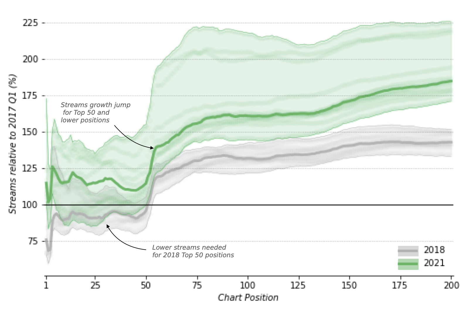
We already know from the first chart that based on the 2022 CPI value, tracks need to be streamed about ~50% more to achieve the same position they had back in 2017. However, the streams needed to reach a particular position grows at a different rate from another position. But instead of showing only select positions like the previous chart, we now plot the growth of streams across all the positions for two whole years, 2018 and 2022.
Distribution of 2018 (gray) and 2021 (green) monthly streams relative to 2017Q1 across all chart positions. The solid line indicates the median, and the shading the range of values for the year.
Looking at the chart above:
-
2018’s Top 50 positions needed about 5-25% less streams than 2017s compared to 2021 when about 10-25% more streams needed to retain the same 2017 positions.
-
Despite the difference in median values, there seems to be a consistent +30% jump in the relative streams for both years starting at Top 50 until around Top 55. This is quite peculiar and might have to do with some internal market rule when tracks reach Top 50.
-
After this Top 50 jump, the relative streams for both years increases slighlty until around Top 90-100 and then plateaus to a fairly constant rate towards lower positions: +30% to +40% for 2018 and +60% to +80% for 2022
Present adjusted positions#
We can explain how inflation in the music streaming market works in a different way. Instead of finding the percentage of streams relative to base year, we can use the base year value and see what place it could afford in the present year’s charts– this is what I call the present adjusted position and is analogous to the CPI adjusted price.
For example, here is a table containing the annual median streams per position for 2017 and 2022. The rightmost column contains the position 2017 streams will achieve at present.
| Chart Position | 2017 median streams | 2022 median streams | 2017 Present Adjusted Positions |
|---|---|---|---|
| 1 | 245,738 | 293,891 | 5 |
| 2 | 204,488 | 270,587 | 8 |
| 3 | 189,154 | 265,914 | 10 |
| 4 | 165,006 | 255,902 | 12 |
| 5 | 156,028 | 235,180 | 14 |
Using the table above, a chart topper in 2017 will only get to the 5th spot, since its 245,738 views will not be able to beat 2022’s 4th spot at 255,902 streams. Likewise, a typical 2017 Top 2 track will only reach 2022’s Top 8 spot, 2017 Top 3 is a 2022 Top 10, etc.
To better observe the trend across all 200 positions, I have plotted the 2017 base year and the 2022 present adjusted positions in the chart below.
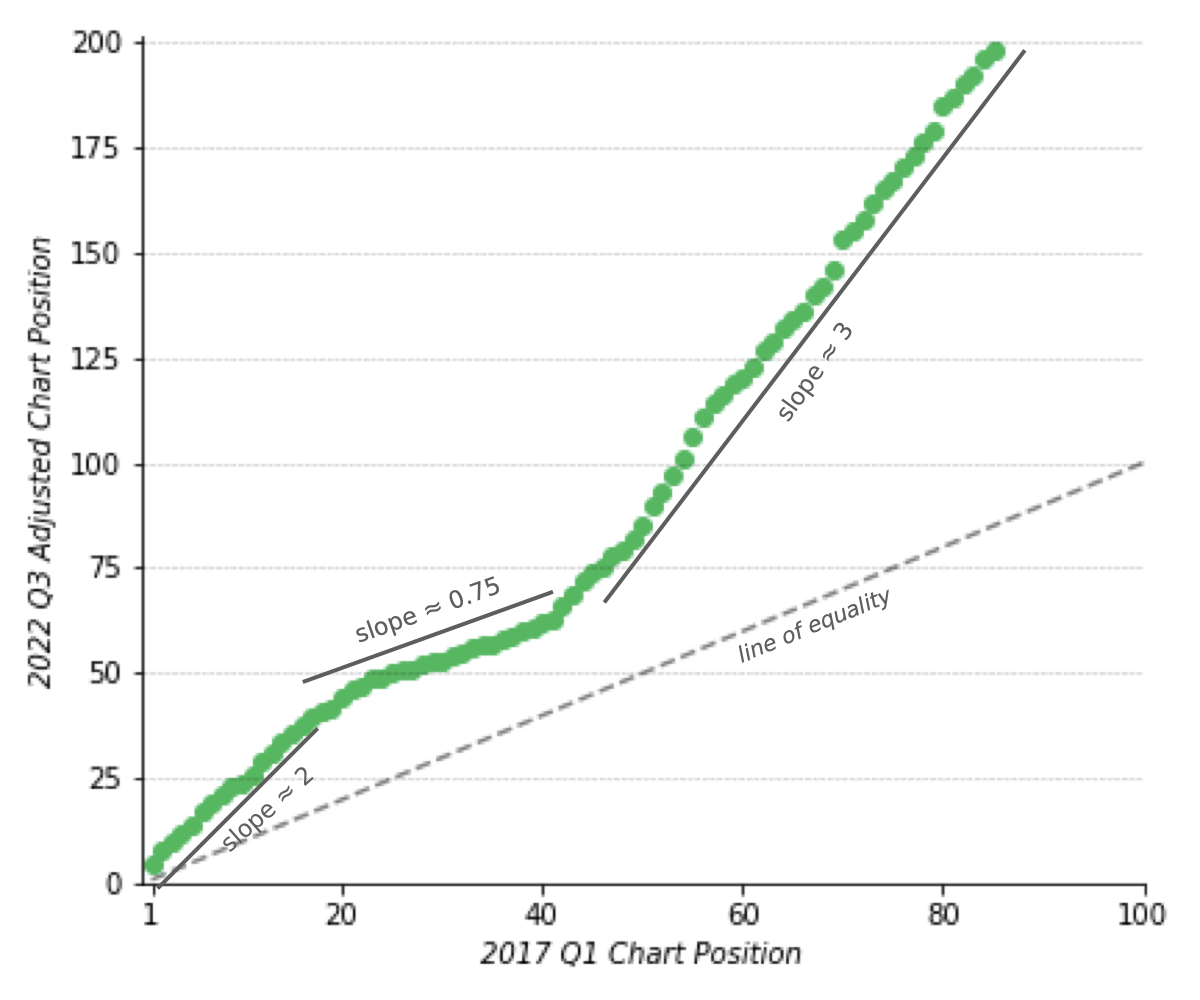
Base year positions vs. present adjusted positions
The data x-axis values here stops at Top 85 because the 2017 streams for this position is only enough to land to the last position in the charts.
You may observe that the adjusted positions does not necessarily increase in one constant linear rate, which is consistent with the different stream growth rates we observed in the previous chart. However, if we only look at certain position ranges, there seems to be strong linearity especially on the Top 1-20 and above Top 40 positions, where the adjusted positions are 2-3x that of the base year values.
Overall, the charts tell us that it would be a lot harder now to get the same positions in the past due to inflation. Furthermore, it is harder now to even enter the chart because the streams required for lower positions grow faster than the higher ones.
One more factor will add to the current challenges in the market–inequality.
Measuring inequality in the music streaming market#
What is the Gini index?#
The Gini index or Gini coefficient is a measure of income distribution among a population and an indicator of overall economic inequality. It was developed by the Italian statistician Corrado Gini in 1912 [3].
A Gini index value of 0 represents perfect equality and 1 representing perfect inequality. To illustrate this, a country in which every citizen has the same income would have an income Gini index of 0. On the other hand, a country in which one citizen earned all the income, while everyone else earned nothing, would have an income Gini index of 1 [3].
However, Gini index should not be mistaken for an absolute measurement of wealth. A high-income country and a low-income one can have the same Gini index, as long as incomes are distributed similarly. For example,Turkey and USA both had income Gini indices of around 0.39–0.40 in 2016., but Turkey’s per capita GDP was less than half of the USA [3].
The Gini index has also been applied to non-economics use cases. The concept is the same–the higher the value of an index, more dispersed is the data.
Alternatively, the Gini index can also be calculated as the half of the relative mean absolute difference. How then do we calculate the Gini index for the general use case? There are many ways to obtain it, but the simple implementation of it uses the fact that the Gini index is half the relative mean absolute difference of 2 sets of variables. I used the function below that I obtained from this source [4].
def gini(x):

    # Mean absolute difference
    mad = np.abs(np.subtract.outer(x, x)).mean()
    # Relative mean absolute difference
    rmad = mad/np.mean(x)
    # Gini index is half of Relative mean absolute difference
    g = 0.5 * rmad
    return g
More equally-distributed streams from 2017 to 2022#
We have shown in the first chart that the Gini index has been decreasing. We can look at this in more detail by examining the distribution of the Gini index values per year.
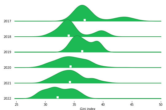
Yearly Gini index distributions for the PH Spotify Daily Top 200 charts. The white square indicates the median of the distribution.
-
The distributions for the first 3 years 2017-2019 are noticeably bimodal. The second peak during 2017-2018 is skewed much further to the right, corresponding to dates when the more famous artists dominate the chart with much fewer competition than present. The higher peak stayed at around Gini index = 35, except during 2018 when there was a 3 point drop in the median (I have yet to take a look at this closely) and increased again come 2019.
-
For 2020-2021, the Gini distribution median decreased from 2019 value to around 34, with the shape roughly similar to each other.
-
At present, the Gini distribution median is at 32, and shifted towards lower values compared to the rest of the years. However, we could expect this to rise when the artists who dominate the charts release their new songs in the coming months.
What does a high/low Gini day look like in the streaming market?#
Lets compute the Gini values for certain days and show how they look like.
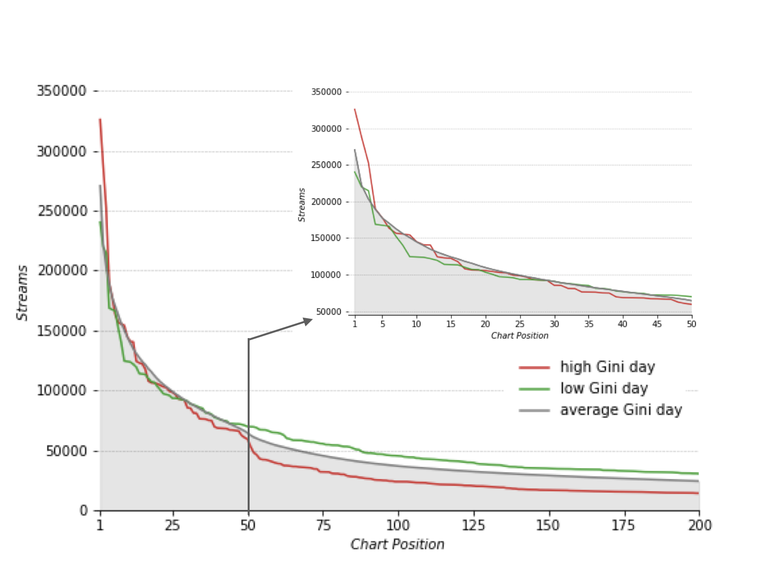
Yearly Gini
Above is a streams vs position plot of a high Gini index (=46.45) day on January 28, 2017 and a low Gini index (=28.28) day on December 16, 2020. We compare this to all days when the Gini index value is at 34-35, the mean Gini value for the entire data.
-
Top 5 of high Gini day has 50000-80000 more streams compared to average, while Top 5-20 of low Gini days have 20000-30000 less streams.
-
Top 25-50 of high, low, and average Gini days seem to have almost identical streams.
-
Top 50-200 high Gini day has 15k less streams, while 10k more streams than average.
How do popular artists affect the streams distribution?#
Certain artists, when they appear in the charts, reach the Top 1 position with very high streams and thus lead to high Gini market conditions. To be specific, these artists land on the Top 1 position with a day Gini index value greater than 40 (around 90th percentile of values from 2017-2022).
The table below lists these artists, and their mean Gini index values for all the days that they have placed at least Top 3 in the charts.
| Top 1 Artist | Average Gini index |
|---|---|
| juan karlos | 39.5 |
| This Band | 38.9 |
| Bruno Mars | 38.2 |
| Matthaios | 38.0 |
| Ed Sheeran | 37.4 |
| December Avenue | 37.1 |
| Sam Smith | 36.7 |
| Taylor Swift | 35.6 |
| Ariana Grande | 35.1 |
| BLACKPINK | 35.0 |
| BTS | 34.9 |
The effect of Gini conditions on adjusted positions#
Lastly, I wanted to know how the Gini conditions translate to increase/decrease of positions when I convert the 2017 streams to its 2022 equivalent. Lets see what will happen if we segregate the high Gini index from the low Gini index days.
| Chart Position | 2017 average streams | 2022 Low Gini average streams | Low Gini adjusted position | 2022 High Gini average streams | High Gini adjusted position |
|---|---|---|---|---|---|
| 1 | 245,738 | 242,483 | 1 | 307,076 | 5 |
| 2 | 204,488 | 227,155 | 6 | 280,956 | 8 |
| 3 | 189,154 | 224,258 | 8 | 273,869 | 10 |
| 4 | 165,006 | 218,265 | 11 | 260,930 | 13 |
| 5 | 156,028 | 208,496 | 12 | 243,699 | 14 |
From the table above, we see that the 2022 adjusted position kept the 2017 streams at Top 1 for low Gini index days compared to high Gini days when it dropped to Top 5. This is consistent for the first 5 positions.
The plot below shows the difference in present adjusted positions of low Gini index days to high Gini index days for all the Top 200 positions.
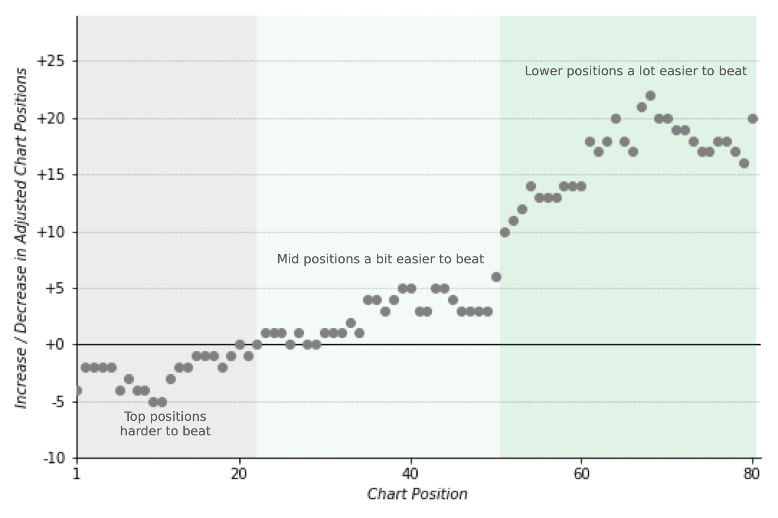
Difference of present adjusted positions achieved by 2017 streams for a high Gini index (<30) vs low Gini index days(>30) on 2022 Q1. Signs indicate the natural direction of ascent/descent in the charts, i.e. a y=-4 when x=1 shows that the Top 1 Position has dropped to the Top 5 position, etc.
What does this plot say?
-
For a high Gini index day, it would be much harder to achieve the top chart positions (up to Top 23), where 2017 positions translate to 5 positions lower than you may achieve for low Gini index days.
-
For the rest of the positions, you may expect to gain higher adjusted values because of the lower streams required for high Gini index days. This ease of getting lower positions, especially for Top 50 and lower, may even lead to up to 22 positions higher than a low Gini index day.
Flip the chart on the x-axis and it will show you the effect for low Gini index day– higher positions are easier to achieve with just 2017 level streams, but it would be much harder to enter the charts since they would now require more streams than a high Gini day.
In summary#
If I were a music producer/artist, how can I use this analysis to improve my performance in the charts? I can synthesize my results to these few key points:
-
Over the past 5 years, the music charts CPI has increased and now indicates that tracks need to be streamed about ~50% more to achieve the same position they had back in 2017.
-
It is now harder to get in the Top 200 charts because the Top 100-200 positions now require 60-80% more streams than they used to have back in 2017. If a track will use 2017 as their benchmark performance, they would only get a position 2-3x lower than they previously achieved.
-
Using the Gini index, we notice that streams are now relatively more equitably distributed across the chart positions in 2022 than 2017. However, the market more often than not shifts to less equitable conditions when certain artists rank at the top of the charts.
-
A new track that is just starting to gain popularity can take advantage of a high Gini day to make it to the charts because of lower-than-usual needed streams for lower positions.
-
On the other hand, because the top spots have lower-than-usual needed streams during low Gini index days, it makes it easier for tracks already in the charts to push and aim for higher chart positions.
Where can we take this further?#
• Weighting per chart position
We can adjust the weights in computing the CPI in such a way that specific position milestones like Top 10, Top 50, and Top 100 may be given more importance. This requires some more investigation and may require input from domain experts.
• CPI per genre
We may group the tracks according to genre to see which kind of music grows faster and could make the market less competitive. Pop songs are a candidate to this, by virtue of them being pop songs.
However, Spotify does not provide a genre per track, but instead computes certain metrics related to a music concept, like loudness, danceability, energy etc. These are what they call audio features and you may check them out in their API documentation.
• Any use case with a competitive market and regularly updating data
The same analysis method can be used to assess the inflation and inequality of markets that have reffularly updating data. For example, we may apply the methods above to assess the increasing rates and competitiveness of airline ticketing sites, as well as rental prices for hotels and other properties. One may even conduct sub-daily computations of CPI and Gini idnex on them provided the data also updates subdaily on your end.
Where did the data come from?#
For this analysis, I used the data I collected from Spotify charts.
What are the tools I used?#
I used pandas to read and analyze the dataset, matplotlib and seaborn to make some basic plots. This time, I have also used popular online data visualization tools datawrapper and Tableau to make the final interactive charts.
Thanks for reading this and see you in the next blog!
References#
[1] Philippine Statistics Authority. CONSUMER PRICE INDEX (CPI) https://psa.gov.ph/sites/default/files/Primer%20on%20Consumer%20Price%20Index2_1_0.pdf
[2] Indeed Editorial Team (2022). How To Calculate CPI (Consumer Price Index) https://www.indeed.com/career-advice/career-development/how-to-calculate-cpi
[3] Juhi Ramzai (2020). Clearly Explained: Gini coefficient and Lorenz curve https://towardsdatascience.com/clearly-explained-gini-coefficient-and-lorenz-curve-fe6f5dcdc07
[4] Calculating Gini coefficient in Python/numpy https://stackoverflow.com/questions/39512260/calculating-gini-coefficient-in-python-numpy
